

-
-
II. TSP performance charts
-
-
-
-
-
Historical TSP Fund Performance
TSP Charts

TSP Fund Performance Characteristics
A picture tells a 1000 words so we will start with some charts. But the picture does not tell us "why" so we will dig below the surface to explain why the composition of the funds determines performance characteristics and their different responses to policy decisions. You might be surprised to learn the economy and profits do not drive the prices of the indexes as much as cycles in valuations which are determined by flows into and out of the markets... driven by investor sentiment that is in turn driven more and more by monetary interventions by our central bank.
Using the market index data for the TSP C and S fund we were able to calculate the TSP C and TSP S share prices back to 1987 when the TSP S fund's index was first developed. We were also able to extrapolate the TSP G fund prices using the TSP websites monthly returns back to this time also. We wanted to research strategies for the funds and this required looking back further than 2003. This also enabled us to produce charts like the one below.

It is surprising the two US equity funds were in a dead heat looking over 27 years. But as you see, it has not always been this close. During the 2000 stock market bubble, the SP500 outperformed significantly and the TSP S fund (which I call the non-sp500 index) lagged except during that melt up in late 1999. The two funds were back to even by 2011 after taking beating during the two bear markets. Our research on the driver of the late 1999 surge in small caps informs our allocation decisions today. More on this later.
The Thrift Savings Plan began publishing daily prices in 2003 with all the funds starting with a share price of 10. The chart below is the typical chart found on many website. The problem with this chart is that it begins shortly after the market bottom in 2003 which makes it a little misleading from a long-term perspective. Why? Because as you see in the chart above, the small caps were behind the large cap TSP C fund in 2003 and had some catching up to do.
To be clear, the apparent out-performance of the TSP S fund has more to do with when they set the price of all the funds to 10 in 2003 than consistent out performance.

If we advance our chart to 2011, we see a different picture. From 2011 to 2017, the TSP C fund outperformed the S fund. This continued until the markets broke in 2020 and the Federal Reserve flooded the financial system with trillions in a couple of months. The small caps which do better in rallies bounced back, but then completely closed the gap with the C fund since 2011 in a few months. In my opinion the flood broke many wall street trading strategies and forced buying of small caps by those who had been shorting these stocks. Another way of saying this is that the small cap funds are more sensitive to liquidity and when the Fed flooded the markets in 2020 they surged higher. But when liquidity dried up in early 2020 the crashed further.
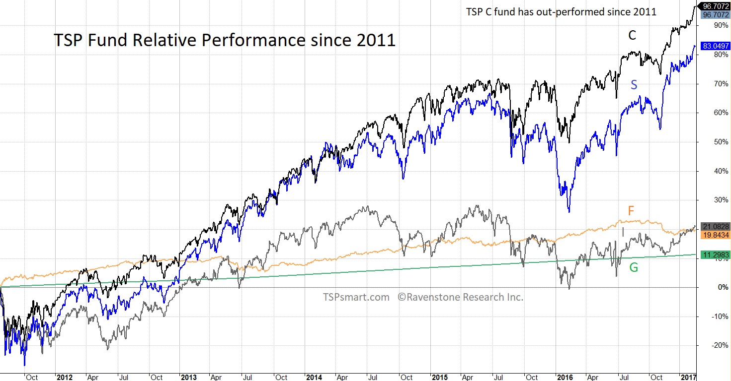
A couple of key points from these longer term charts are small cap stocks do not always grow faster than the large cap stocks. The small caps have been more volatile also meaning they advance more in bull markets and lose more in bear markets. The worse time to hold small cap funds (TSP S fund) would be during a bear market. The best time to hold the small cap funds would be at the beginning of a bull market. The same is usually true in smaller market corrections and as we discovered recently AND this same tendency applies *each* year during the market's favorable and un-favorable seasons.
Because of this last small caps tendency, we found they were an especially good candidate for the strategy we were researching at the time that reduces market exposure during the summer and fall of the year the weaker months of the year for the stock market. The following short discussion is why understanding the performance characteristic of each fund matters in allocations.
You may have heard of the saying "Sell in May". In my research of newsletters and investment strategies, I discovered a widely followed newsletter written by Sy Harding who developed an advanced version of "Sell in May" that was designed for broad index funds. Since Sy's strategy only required two allocation changes a year, it met my qualification as "simple" and could be used on TSP accounts. He applied his strategy to the Dow Jones Industrial Averages with extraordinary results.
Building off his work, I optimized the seasonal strategy for the TSP US equity funds. I discovered it worked best with the TSP S fund because of the small cap performance characteristics. The chart below shows what happens when you move to the TSP G fund in the Summer and into the S fund in the Fall based off this objective strategy. See why I consider this one of the best TSP investment strategies. This chart really shows what happens when you avoid the larger losses in the market but capture most of the gains. It is not perfect, but over time it makes a big difference.

The seasonal strategy in large part is driven by flows into and out of the market determined by fiscal policy and our tax code and a few other factors. Most of the positive tendencies happen during the fall and winter and many of the negative factors happen in the Spring and Summer. One simply factor is the US government typically releases new funds starting in the new fiscal year (October) so we see weakness in September as funds dry up then the stock market begins to rally sometime in October as this money flows up into the system. Of course, debt ceiling delays can mess this flow up.
An older flow that continues is from farming where farmers borrow in the Spring and their harvest profits come in during the Fall. And an end-of-year surge comes when Christmas bonuses are paid especially on wall street.
-------------------------------------
This market cycle we have seen a new and larger influence on the markets which can simply be described as the Federal Reserve printing money out-of-thin-air to buy financial assets. This massive flow has been a major influence on the larger market moves this market cycle since 2008. The gray boxes below mark when this intervention (QE) was on-going. The red lines show what happened in-between the interventions. And as we will get to, the small caps tend to move further in both directions up and down during these QE cycles.
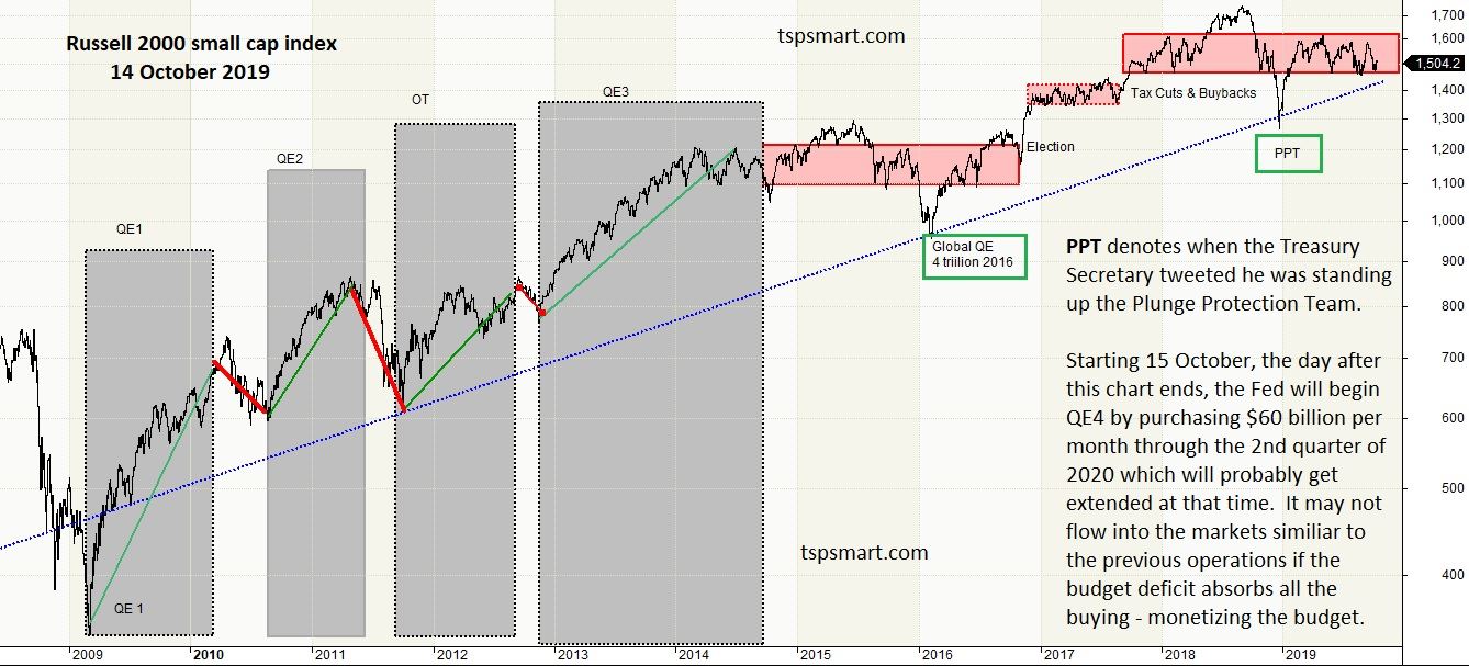
In my market commentary I talk about these forces on the stock market and what policy makers are considering. I will not go into detail here since we need to get to the individual funds but here is an idea of what has been driving the rallies and declines recently. Note: The largest inflow into the stock market this cycle has not been "investors" but actually the corporations buying back their own shares on the open market with cash flow and even borrowing money to do so. This has become a hidden form of leverage in the whole system. Leverage increases gains but also increases losses and when those losses overwhelm the system, we have seen the Federal Reserve step in to save the markets repeatedly. This is a very unstable situation which has led to sharp market corrections as opposed to rounded topping action typical of most bull market tops.
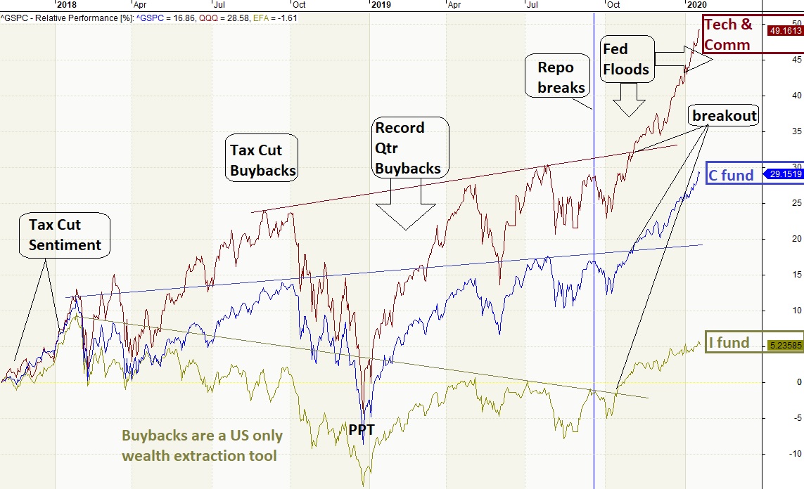
One note on the chart above gives a big hint into why the TSP I fund has underperformed. The rest of the world frowns on corporations buying their own shares and it used to be illegal in the US but not this market cycle. Outside of corporate buybacks (burning cash and not investing in future business growth) all the other flows in our stock market are net negative meaning boomers are taking more money out of the market than everyone else is investing.
Comparing the TSP Equity Funds
We are going to look at the 3 equity funds and compare their composition to understand what we are investing in. It illuminates why following the academia portfolio allocations really makes little sense these days.
The index the TSP International fund tracks has not been around as long as the TSP S fund index so we first look at the two US funds over the longer period of time.

The TSP S fund started in 2003 near the bottom of a bear market. It's outperformance is one of chance having under-performed since 1994 when the index the fund tracks was first designed.
Combined the TSP C fund and TSP S fund account for the bulk of US companies listed on US exchanges. The TSP C fund has around 500 of the largest US companies, hence the name SP500. The TSP S fund captures all the rest of the US stocks and this is why I like to call it the non-sp500 index for simplicity. In the late 1990s, there were over 12,000 companies in the US and now we are sitting with about 4000 of which 3500 are in the TSP S fund.
While the TSP S fund has 7x as many stocks, the total value of these companies is only around 20% of the total US stock market. The TSP C fund accounts for 80%. There are many SP500 funds outside of TSP, but there are few exactly like the TSP S fund - one is the Vanguard fund (VXF ETF) that tracks the same index. We use this to watch the real-time performance of the TSP S fund because ETFs trade like stocks.
If you look at the TSP Lifecycle funds you will note that among the equity funds, they each hold a percentage based on the market value of each index. The ratio between the C and S fund matches their values (4 to 1). If you hold a 50/50 allocation then you are over-weighting small caps. To hold the total US market, you need to allocate 4x as much to the C fund as the S fund.
While the funds hold stocks, we break down the composition into sectors for a better understanding of how each sector of the market is performing. There are sector funds outside of the TSP and the Tech sector is very popular today. Here is a snap shot from 15 August 2021 of the weighting of each sector in each fund.
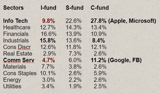
In the sector breakdown above you can see a huge difference in composition of the US funds and International fund. The IT and Communication Services sectors account for about 40% of the SP500 index versus less than 15% of the TSP I fund (International fund). Tech has dominated returns, revenue growth, profits and cash flow this cycle globally. And therefore these sectors have dominated buybacks and pushed their stocks even higher on this economy-eroding use of cash.
The old industrial sectors only account for 16% of the SP500 and 21% of the S fund today, but 30% of the TSP I fund. The leading sector in the International fund is the financial sector and many banks in Europe are in deep trouble and explain the $120 billion per month of money printing by the European Central Bank today.
I have not recommended the TSP I fund since my services inception because of its performance based on these factors. I may in the future but some factors need to change.
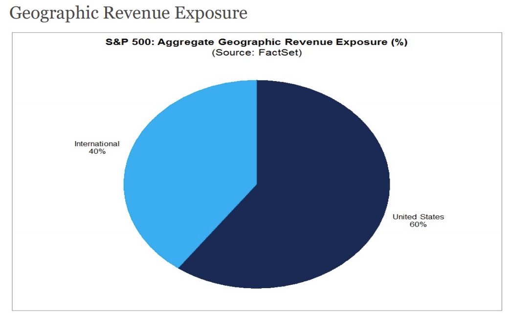
So does this mean we are missing out on overseas growth? Oh contraire.
The SP500 Tech Sector's revenue is 60% non-US revenue. For the SP500 overall, about 40% is international revenues. The point is the SP500's revenue IS geographically diversified already. And if one adds in the TSP I fund to your allocations you are actually under-weighting the Tech sector because the TSP I fund only holds 10% Tech. Do not dilute your *revenue* diversification by holding the TSP I fund or Lifecycle funds.
How important is Tech to the US markets and the out-performance of the US over International fund:
US listed tech is running away with the profits and cash flow in the global economy.
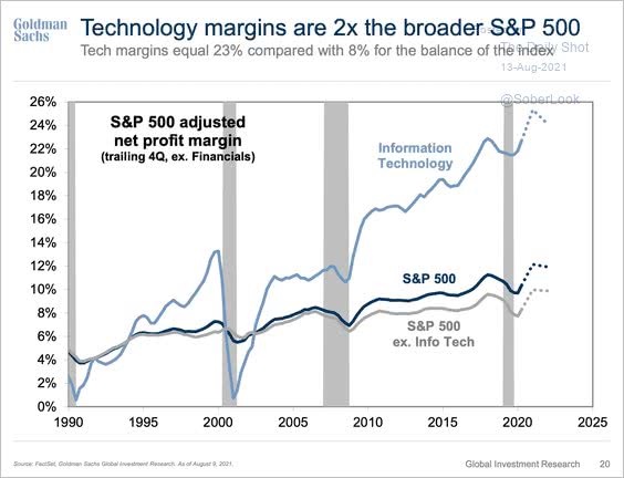
The chart above shows the growing profit margins of the US economy, not price or valuations of the stock market. Higher profit margins do lead to higher valuations but price has moved much further than these valuations imply make sense. But it more than the tech sector, we now have a few mega companies dominating the scene and they also include Amazon which is a quasi-tech company.
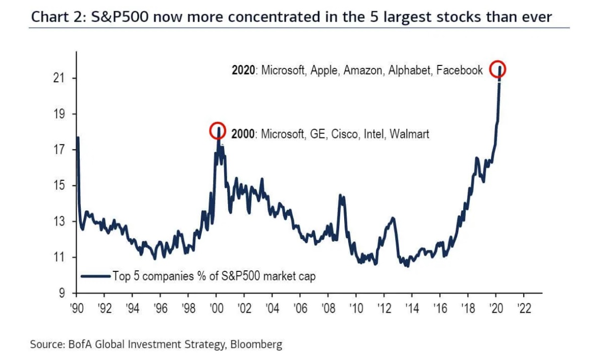
Sometimes the mega companies are the only show in town. They have even become defensive plays in the stock market. When small caps underperform the mega caps for an extended time, this is a warning sign the broader market is weak.
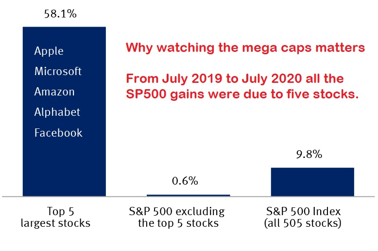
These five companies are in the TSP C fund. Apple alone is worth more than the 2000 companies in the Russell 2000 which are a subset of the TSP S fund. So the large US companies bolster your returns and provide a defensive anchor as the market cycle turns down.
How does all of this inform our allocation decisions?
The TSP I fund does not offer a diversification advantage today over holding just the US equity funds. The TSP C fund is diversified not only in the TSP I fund countries but also the emerging markets in terms of revenue. Adding the TSP I fund reduces our weighting to Tech which has hurt its returns over the US funds. The other large factor is artificial but has an impact on price movements. The US has buybacks but other countries do not. I do not like this feature in our laws, but it is a consideration in allocation decisions.
So when the market is trending higher one needs to determine how to allocate between the TSP C and S fund. We've mentioned the seasonal considerations and the top and bottom of rallies and bull/bear markets. Otherwise, the far larger consideration is how much to allocate to the safe and stable funds versus these equity funds due to the fact market cycles have not been outlawed.
Why would the market cycle like seen in the next chart?
Is it the economy and earnings? No. Earnings do cycle a bit, but the larger moves are simply people paying higher prices for the same $1 of revenue or earnings until it reaches an extreme and then reverts to something reasonable.
Do you know how much you are paying today for $1 of SP500 revenue today compared to the historical mean of $1 price per $1 revenue? It may not matter in any one year, but over the full market cycle it matters to know where you are in this cycle.

Both the bear markets shown above lost over 50% in the TSP C fund and more in the small cap fund. A 50% loss requires a 100% gain to breakeven which typically takes many years.
press ahead to
Back up to our overview